MindSweep is a cleaning app concept, designed for a UK city dweller. As a working professional, I often hear horror stories about messy housemates and lack of time. I wondered: is it really that hard to keep one’s home clean? Could technology help? I decided to find out.
RESEARCH
My hypothesis was that the problem lied in accountability. People who share homes don’t stick to cleaning rotas, lack clear agreements about who’s doing what etc. My research - in form of interviews and a survey - proved that that hypothesis was wrong.
The survey revealed that majority of my respondents have used a cleaning service. Their reasons? Feeling tired, dislike of cleaning, experiencing less frustration when house-sharing. Rotas and agreements seemed things of the past. Inability to find a suitable cleaner seemed the current issue.
Thanks to the research I realised that cleaning is likely to be outsourced more and more. Technology could help in minimising pains related to this outsourcing. This was the beginning of the MindSweep app concept.
HEURISTIC ANALYSIS
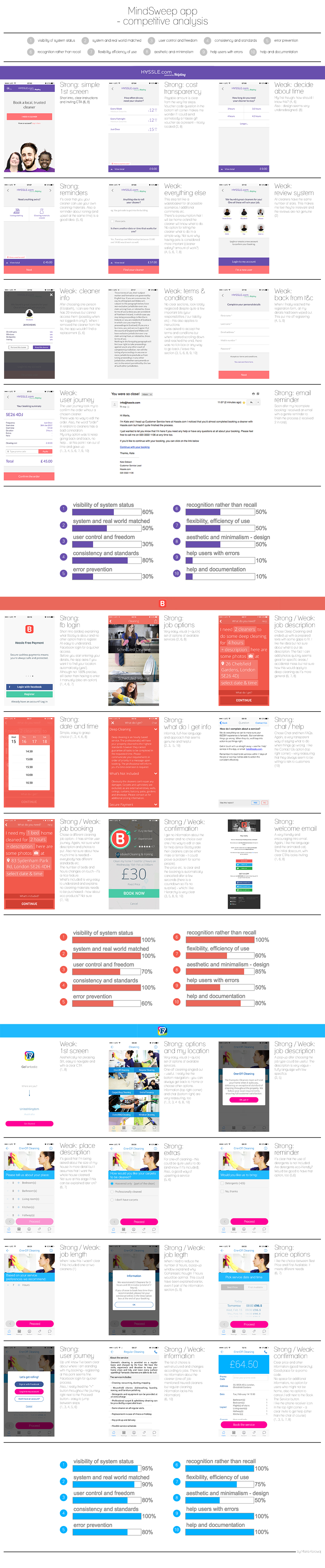
To avoid creating features that nobody or at least not many people looking for a cleaner use, I needed to see what’s already out there, a benchmark to begin with. I found some competition - three similar applications ranging from 100% cleaning-related to those dealing with all house maintenance jobs. And I tested them using Nielsen Norman Group’s analysis list.
Surprisingly, the application wholly dedicated to cleaning, turned out least appealing and often most confusing. This part of my research made me aware of a need for balance between visual and verbal communication in the product design. I could also clearly see how creating a user journey that resulted in reaching a dead end was very easy to ‘achieve’ and to be avoided at all cost.
By exploring various app features, I ended up with many more questions that needed answering. What were the frustrations of MindSweep users? Would they choose their cleaner or see it as an additional pain? Would they be home for the cleaner’s visit?
It was time to give my full attention to the users again.
EMPATHY MAPS AND PERSONAS
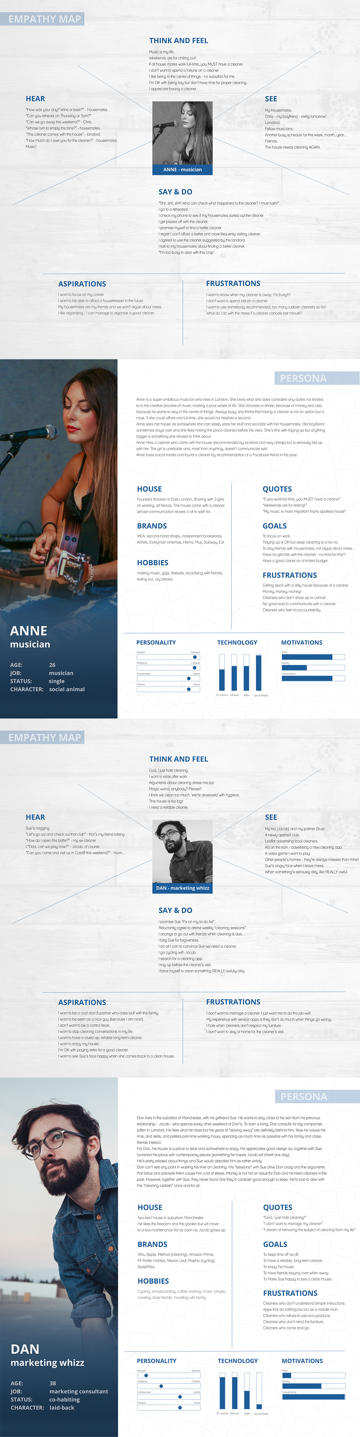
Back to focusing on the user. I went through all my interview recordings and survey results again and grouped people with similar worldview, needs and pain points with regards to cleaning.
Keeping in mind users’ and business requirements, I ended up with 2 main personas: Anne and Dan. Both living in cities and working but with different ambitions, needs and spending power.
This stage of the UX design process allowed me to deeply connect with the users, differentiate them from among many and see specific, more tangible problems to address later. It was insightful to see how the earlier research helped to shape the personas - for example some quotes belong to my interviewees.
USER STORIES AND MINIMUM VIABLE PRODUCT FEATURES
User pain points and needs, on the other hand, were transformed into the app features. Diligently, I went through a whole bunch of them and following the "As a user I want to... so that I can" mantra ended up with all kinds of features- more and less urgent - to be explored.
Afterwards, I carefully and rather ruthlessly eliminated all but five of them in order to decide on what would be satisfactory to develop as the first minimum viable product.
I must admit that my stories were rather epic - a mistake to learn from before creating another product.
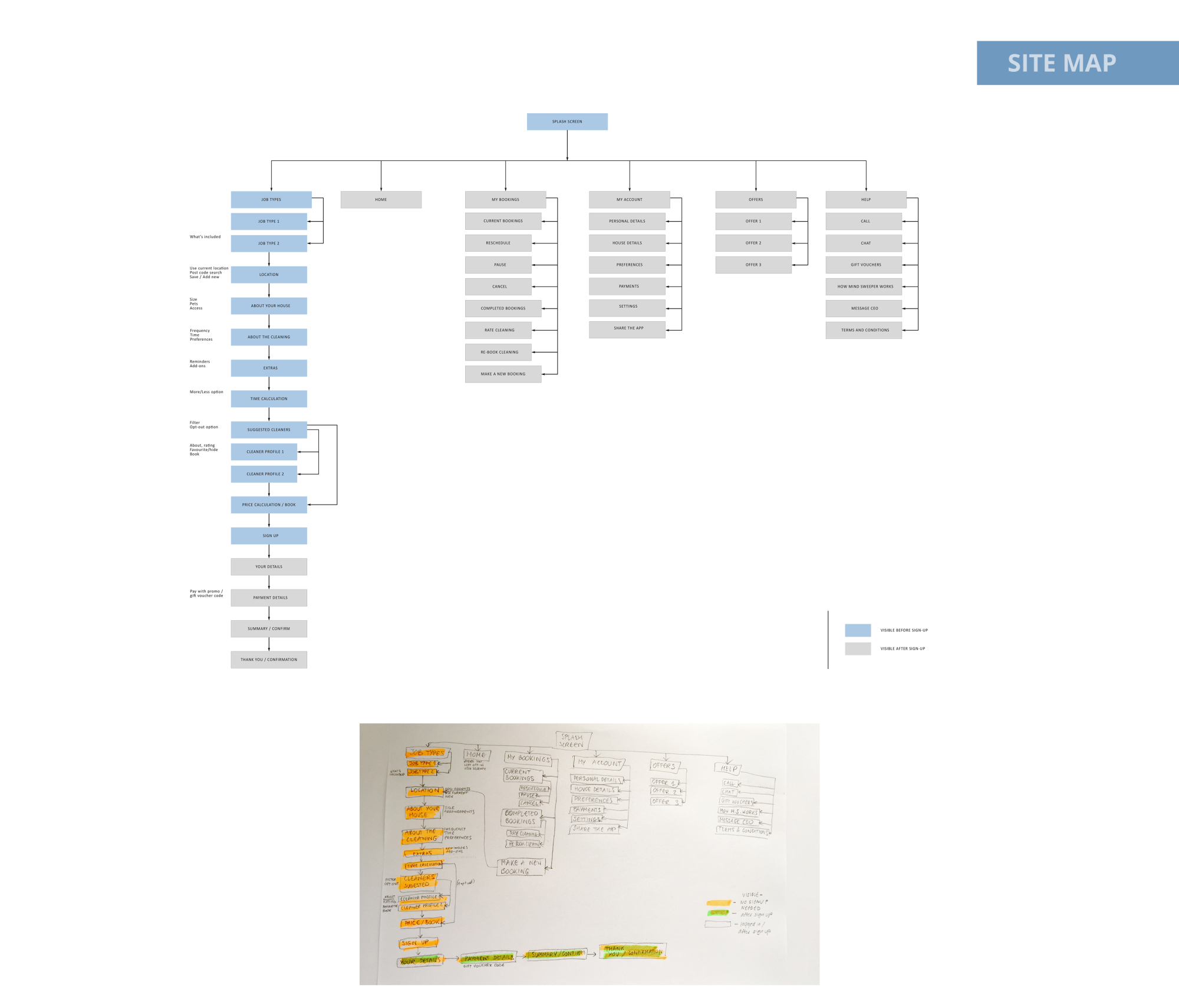
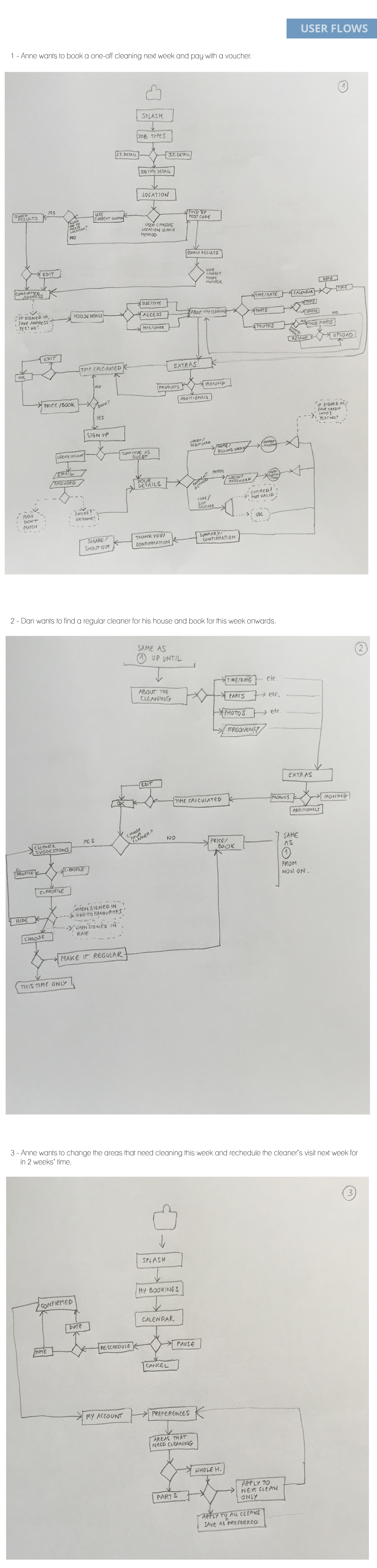
USER FLOWS
It was time to connect Anne’s and Dan’s more specific cleaning needs with the ways MindSweep could address them.
I chose three common situation - booking a one-off cleaning, booking a regular cleaner as a new user and making changes to a booked cleaning - and sketched user journeys for them. They would dictate the looks of MindSweep wireframes and so connect to its prototype at a later stage.
Sketching proved fun, practical - I did plenty of erasing and re-sketching - and very encouraging to explore various options.
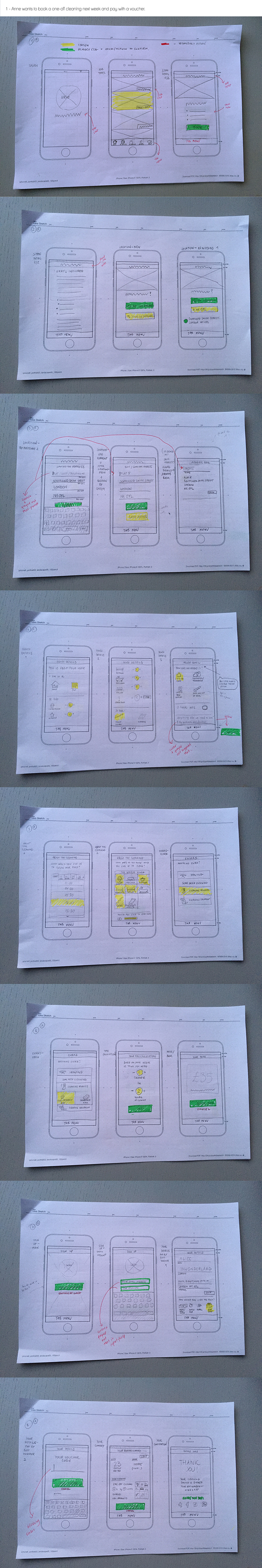
WIREFRAMES AND A WORKING PROTOTYPE
More sketching - this time turning the user flows into a set of screens. As useful as analysing competitive apps is, little does it help to avoid cognitive bias of the app creators. To prevent it from happening, I created rough wireframes followed by a low-fi clickable prototype. The only way to find out if MindSweep were usable was to test it. And what better way than giving the app prototype to a group of potential users?
USABILITY TESTING
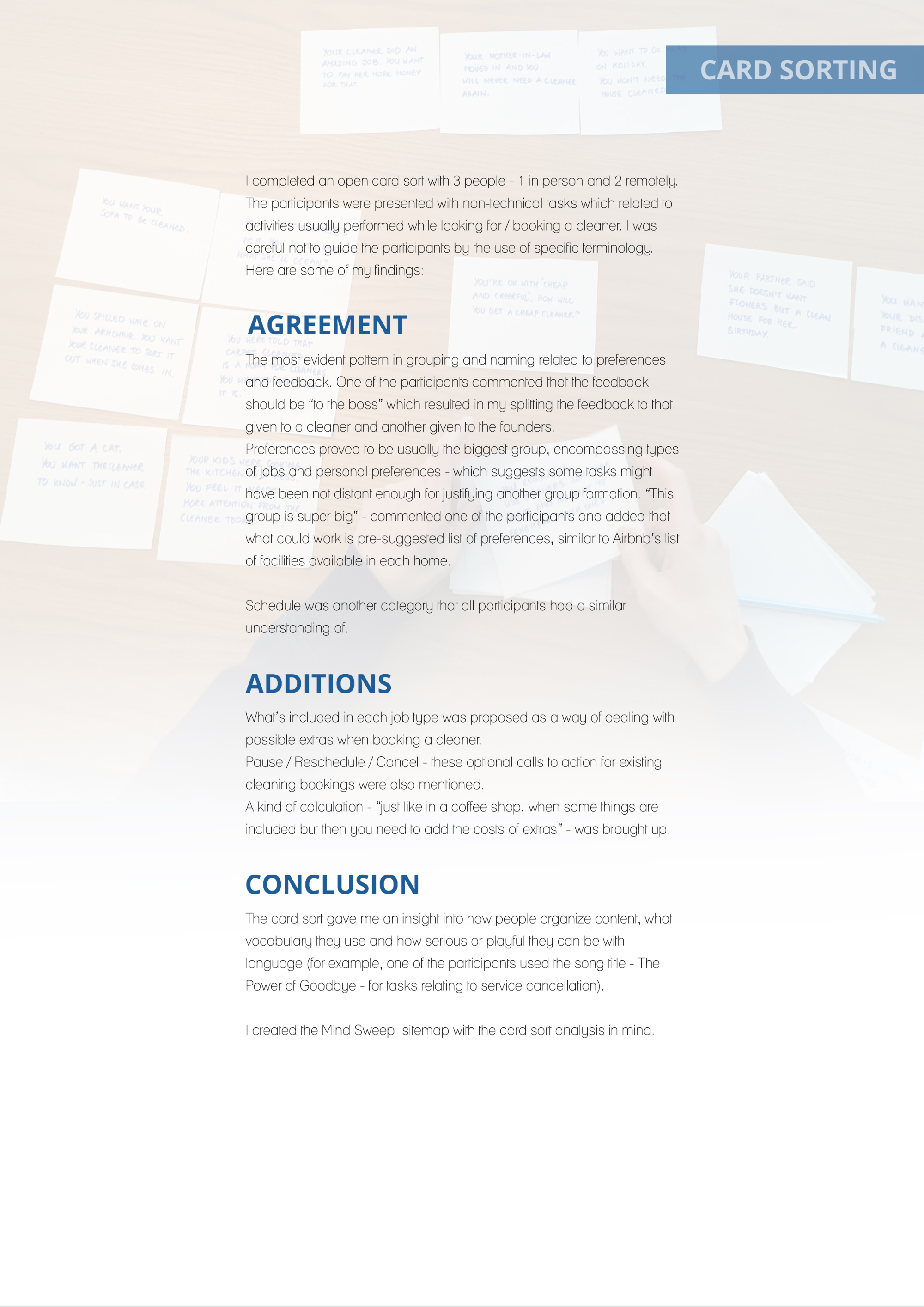
I observed 3 people using MindSweep prototype. All stumbled upon a place in one user journey which made no sense to them - in hindsight, a reverse card sorting should have prevented this problem from happening.
Some feedback was quite detailed (especially regarding visual design) which proved very insightful. However, it needs to be treated with caution in order to avoid perfectionism, especially when the risks associated with these changes are low and change little in the user’s experience.
See MindSweep usbility testing results here.
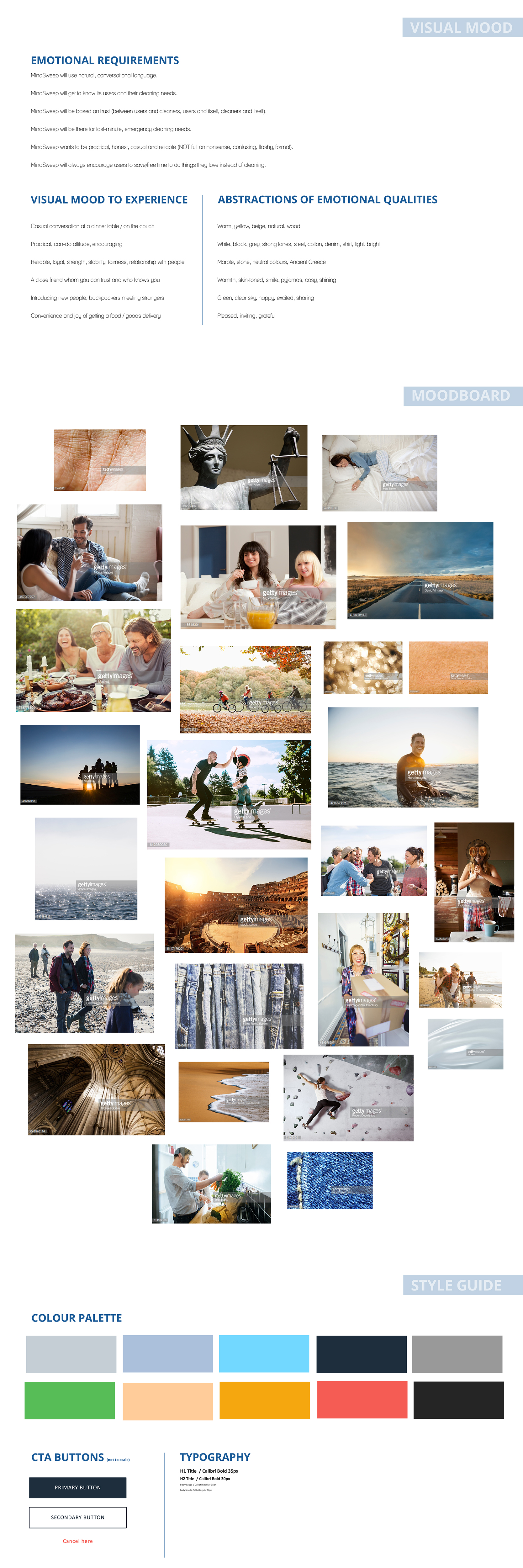
STYLE GUIDE
Using Jon Kolko’s approach to creating visual mood based on emotions, I created style guides for MindSweep.
Specifying what MindSweep does, why and how for its users (emotional requirements), I described situations evoking similar moods paired with abstractions of emotional qualities. This in turn helped me put together a mood board and finally the style guide for MindSweep.